Tanit Math
What Tanit Math Is
Tanit Math is a mental math training app built around four principles: Test, Train, Teach, Track.
It presents math operations one at a time, records every answer, and builds a detailed picture of performance over time. No account and no network required. No ads, no tracking. No data leaves the device unless explicitly exported by the sole user.
The free version provides full access to addition. All other modes — subtraction, multiplication, division and fractions — are available to try before purchase. A one-time purchase unlocks the complete app with no limits: all math modes, full stats and reports, all settings, and data export — allowing practice history to be analysed with any external AI tool.
Navigation
Tanit Math has three screens. Swipe left or right to move between them, or tap  to go to Settings, tap
  to jump to the dashboard.
Three dots at the bottom of the screen show which screen is active.
The Practice Screen
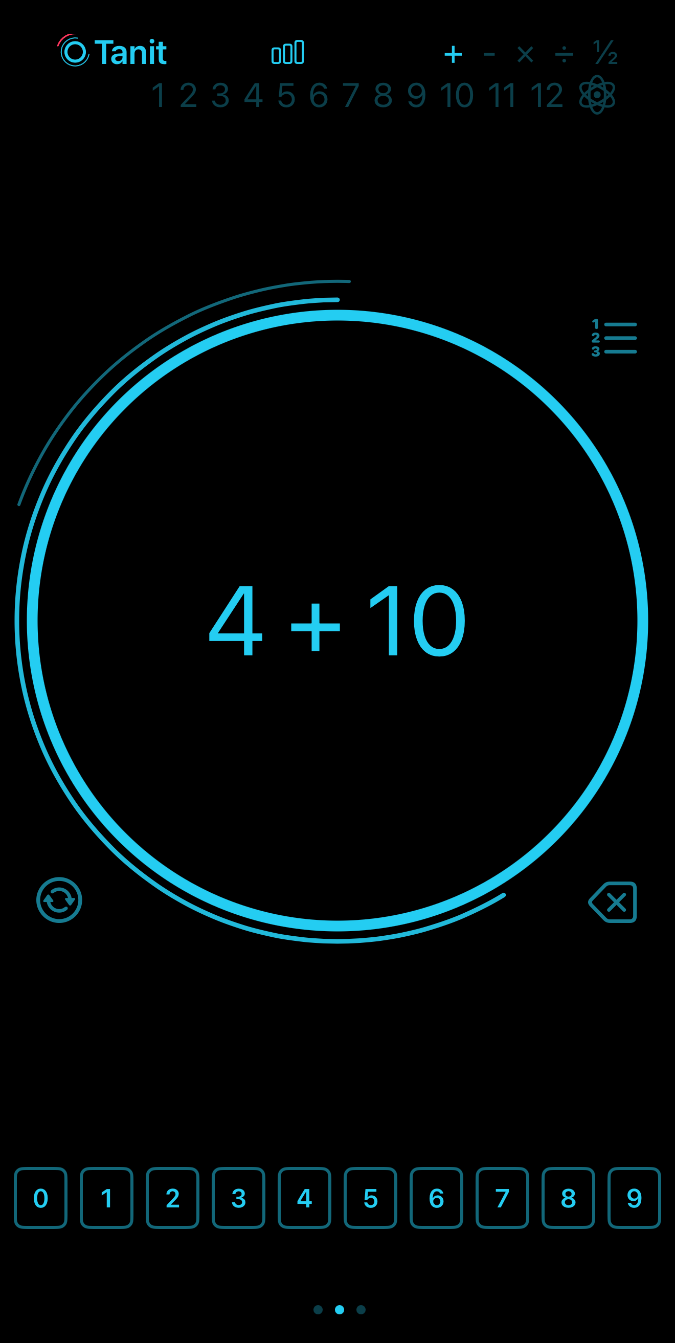
The practice screen displays a single math operation inside a large circle. The answer is submitted by tapping the circle. A numeric keyboard sits below for digit entry.
A timer arc wraps the outer circle, depleting continuously according to the timer setting. It is indicative only — no action is triggered when it runs out.
Around the circle, four controls:
- Top left — arc indicator: dim during the session, flashes red on a wrong answer, lights fully when the session target is reached.
-
 Top right — reference table: shows the reference table for the current mode and submode.
-
 Bottom left — skip: passes the current question without answering.
-
 Bottom right — backspace: one tap removes the last digit; long press clears the entire input.
Long pressing the circle reveals the answer.
On consecutive errors, Tanit Math automatically switches to multiple-choice input (MCQ), presenting a set of candidate answers. If errors persist through MCQ, the correct answer is shown and left on screen.
By default, the numeric keyboard is briefly locked at the start of each question — think first, then answer.
Modes & Submodes
Tanit Math has five modes: + − × ÷ ½
Modes and submodes are selected by tapping the top bar of the practice screen. Tapping a mode activates it; tapping a number below narrows practice to that specific table. A mode without a submode covers all numbers. A mode with a submode restricts to a single table.
The four arithmetic modes (+, −, ×, ÷) each have submodes from 1 through 12 by default. Selecting submode 7 in multiplication restricts practice to the 7 times table.
Modes can be enabled or disabled in Settings — a tap toggles each one on or off.
Fractions (½)
The fraction mode has five submodes:
- = Simplify a fraction to its lowest terms
- + Add two fractions
- − Subtract two fractions
- × Multiply two fractions
- ÷ Divide two fractions
Fraction answers are entered as numerator and denominator separately, using the same numeric keyboard. A dedicated key  switches between the two fields.
Fraction difficulty is adjusted via the chevron next to ½ in Settings. The brighter it glows, the harder the fractions.
Genius
Genius is an adaptive layer that sits on top of the current mode and submode. It continuously analyses correctness, response speed, and historical trends to build an accurate picture of where performance is strong and where it is fragile.
Rather than drilling weak spots relentlessly, Genius applies a balanced strategy: it targets areas that need work while weaving in questions the user handles well. This keeps confidence intact while closing the gaps.
Genius adjusts dynamically within each session — it reads every answer and recalibrates on the fly.
Genius activates automatically when the data warrants it. Paid users can also force it on at any time by tapping ⚛ in the top bar.
Genius can operate at the mode level and the submode level. When active at both levels, it focuses its strategy within the already-narrowed submode.
The Genius line in the dashboard header summarises current findings. Example:
⚛ ⚠ +[2] −[1]↑ ×[9]↓ ÷[4 8]
- The operator indicates the mode.
- Numbers in brackets are the submodes (tables) flagged for attention.
- ↑ means the table is weak but improving.
- ↓ means the table is weak and declining.
- No arrow means the table needs work but the trend is flat.
- The opacity of each number indicates severity — a dim number means a relatively minor weakness, a fully lit number means a more serious one.
The Stats Dashboard
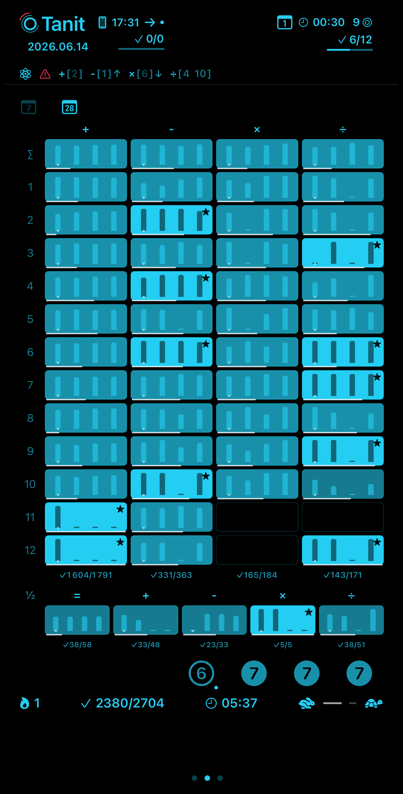
Two buttons above the heatmap grid switch the view:  shows the current week,
  shows the last 28 days. Both views show the same information — the difference is the time window.
 date.
date.The week view gives a detailed picture of the last 7 days, table by table.
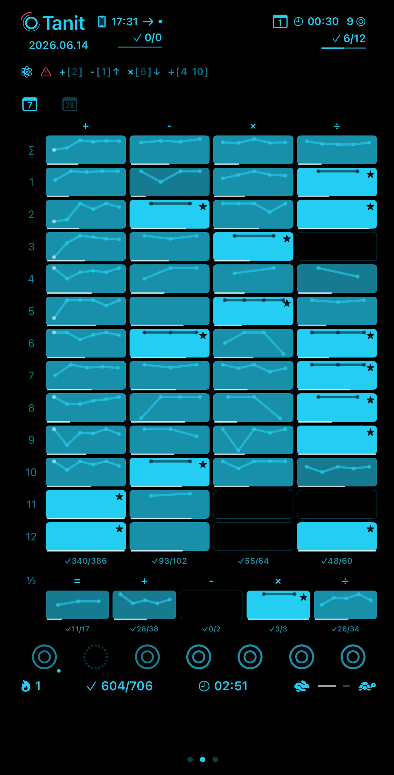
The grid has one row per multiplication table (1 through 12), plus a summary row at the top that totals everything for that operation. The columns are the four operations: + − × ÷. If an operation is disabled, its column doesn't appear.
Each box in the grid represents one specific combination — for example, the box at row 7, column × covers the 7 times table in multiplication. Inside every box there is a small graph. The line in that graph traces how accurately that table was answered each day across the week — it goes up on good days and dips on harder ones. The white dot on the line is today. The brighter and more vivid the box, the stronger the overall performance on that table. A dull or dark box means that table needs attention. The short white bar along the bottom of each box shows response speed — how fast answers are coming in for that table.
A star (★) in the top corner of a box means that table is performing at an excellent level.
Below each column, the total number of correct answers over total attempts is shown for that entire operation across the week.
Below the main grid, the fractions row works exactly the same way, with one box per fraction submode: = + − × ÷.
Below the grid, seven circles represent the seven days of the current week. A solid circle means at least one session was completed that day. A dashed circle means no single session was completed.
The bottom bar shows: current streak in consecutive days the app was used, total correct over total attempts for the last 7 days, total time practiced during the week, and a speed average indicator  .
.
The month view shows the same grid and the same logic, zoomed out to 28 days to reveal longer trends.
The main difference is inside each box. Instead of a day-by-day line, the graph shows four bars — one per week. The height of each bar reflects how well that table was handled during that week. The white dot marks the current week. Everything else — brightness for accuracy, white bar for speed, stars for excellence, column totals, fractions row — works identically to the week view.
Below the grid, four circles replace the seven. Each circle represents one of the four weeks and shows how many days that week had at least one completed session. A trailing dot marks the current active week.
The bottom bar is the same as in the week view: streak, correct over attempts, total time, and the speed average.
Settings
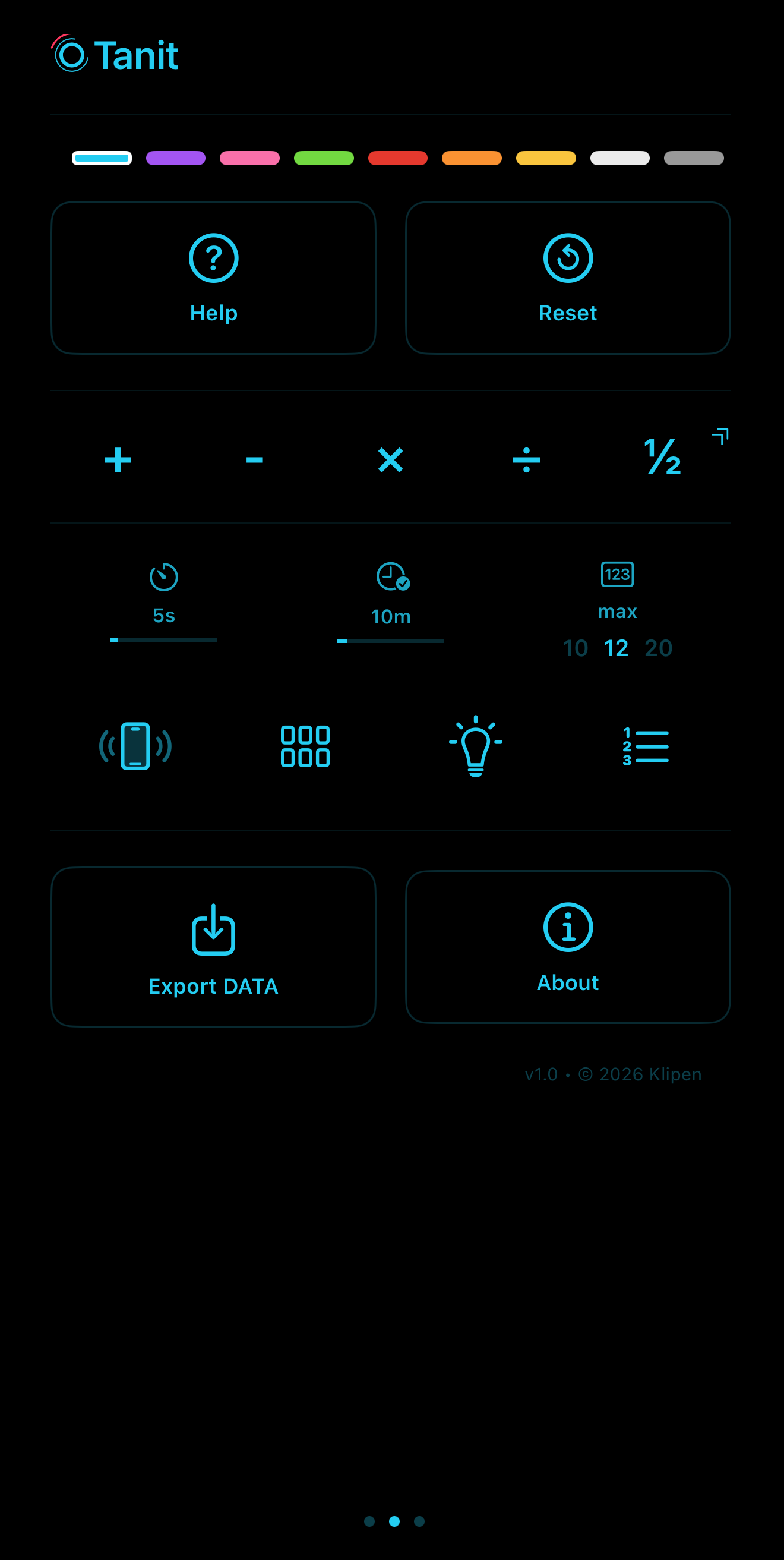
Data Export
Export DATA produces a JSON file of the complete practice history: every question, every answer, every session, every timestamp. Drop it into any AI assistant for a detailed analysis and personalized action plan. The Genius report covers most needs — this is for those who want to dig deeper.
Examples
Select +, no submode. All addition facts, all numbers. A natural starting point — and the foundation everything else builds on.
Select + and tap 7. Every question involves adding 7. Simple, focused, effective.
Once addition feels automatic, select ×. The same structure, the same interface — just a new challenge.
Struggling with the 8 times table? Select × and tap 8. Every question stays there until it clicks.
Select × with no submode. All multiplication facts, all numbers, in any order.
Select a mode, no submode, and go. Ten minutes covers the essentials.
Start with ½ submode =. Simplification is the foundation. Once that feels solid, move to + and − before tackling × and ÷.
Select × with no submode, activate Genius. It roams across all multiplication facts and focuses automatically on the ones that need the most work.
Select × and tap 8, then activate Genius. It stays within the 8 times table and zeroes in on the specific facts that are still shaky.
Open the report. The session header shows exactly what was just practiced — questions asked, answers correct, time spent. Today's totals give the full picture for the day: accuracy, total attempts, and cumulative time. A quick glance at the Genius line surfaces what is currently weak.
The week view shows the daily trend across the last 7 days, fact by fact — accuracy in the brightness of each box, response speed in the white bar below it, stars marking what is already excellent. The circles below show which days had sessions. The streak and totals at the bottom tell the full story at a glance. Tap to zoom out, see the weekly bars build up, and watch the progress add up.